暂定为记录各式数据科学项目、Kaggle竞赛里面常用、有用的代码片段、API、神操作等,通常是Numpy、Pandas、Matplotlib、Seaborn等相关,通常来说,项目基本步骤可以分为EDA、特征工程以及调参。
基本流程
以一个Kaggle上的House Price为案例,机器学习流程分成两个大步骤 :即
输入: 原始Train, Test 数据集,将原始Train和Test 合并成一个数据集combined
处理: Pandas Pipe
根据各种可能和各种特征工程方法定义各种函数(输入combined, 输入pre_combined)
输出:某文件夹下 的N个预处理过的hdf5文件。 针对各种特征工程的排列组合,或者是Kaggle上面的各种新奇的特征工程方法。
机器学习阶段(训练和产生模型,目标是尽可能获得尽可能低的RMSE值(针对训练数据),同时要具有范化的能力(针对测试数据))
第一步,建立基准,筛选出最好的一个(几个)预处理文件(随机数设成固定值)
第二步,针对筛选出来的预处理文件,进行调参。找到最合适的几个算法(通常是RMSE值最低,且不同Kernel)(随机数设成固定值)
第三步,用调好的参数来预处理文件中的Traing数据的做average 和stacking
第四部,生成csv文件,提交到Kaggle 看看得分如何。
准备阶段 与 NoteBook Head 过滤warning:有句话说的好,在计算机科学里,我们只在意错误不在意warning
1
2
import warningswarnings.filterwarnings("ignore" )
工作目录切换到当前python文件所在目录
1
2
import osos.chdir(os.path.dirname(os.path.abspath(__file__)))
Notebook交互输出所有结果
1
2
from IPython.core.interactiveshell import InteractiveShellInteractiveShell.ast_node_interactivity='all'
结果如下
以上可以通过设置固定下来,方法如下:
一般对train以及test做一个concat,并记录train的条数ntrain
1
2
3
4
5
6
7
8
9
10
train = pd.read_csv("train.csv.gz" ) test = pd.read_csv("test.csv.gz" ) combined = pd.concat([train,test],axis =0 , ignore_index =True ) ntrain = train.shape[0 ] Y_train = train["SalePrice" ] X_train = train.drop(["Id" ,"SalePrice" ],axis=1 ) print ("train data shape:\t " ,train.shape)print ("test data shape:\t " ,test.shape)print ("combined data shape:\t" ,combined.shape)
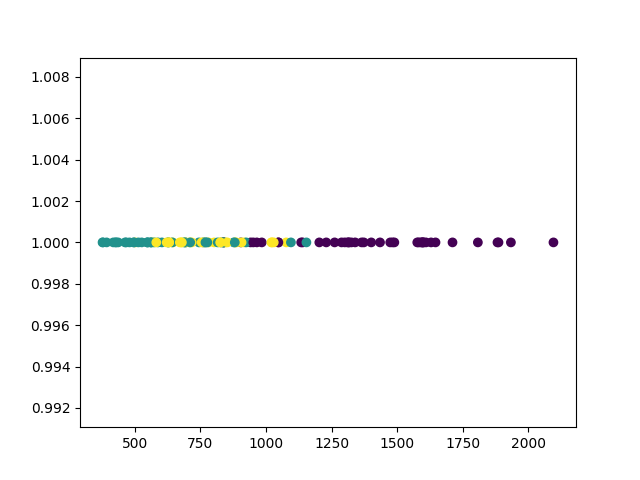
EDA相关 1D Scatter
1
2
3
4
5
6
nca = NCA(num_dims=1 ) nca.fit(xx_t, yy) xxxxx = nca.transform(xx) zeros=np.zeros_like(xxxxx) plt.scatter(xxxxx, zeros+1 ,c=yy[:,np.newaxis]) plt.show()
缺失值分析
1
2
3
4
cols_missing_value = combined.isnull().sum ()/combined.shape[0 ] cols_missing_value = cols_missing_value[cols_missing_value>0 ] print ("How many features is bad/missing value? The answer is:" ,cols_missing_value.shape[0 ])cols_missing_value.sort_values(ascending=False ).head(10 ).plot.barh()
有缺失 - 需要填充或者删除,通常用均值或者中指,或者用人工分析(人工分析是提分关键)
将若干个Dataframe画在同一个图里面相同坐标
1
2
3
4
5
6
7
8
9
fig, ax = plt.subplots() for desc, group in Energy_sources: group.plot(x = group.index, y='Value' , label=desc,ax = ax, title='Carbon Emissions per Energy Source' , fontsize = 20 ) ax.set_xlabel('Time(Monthly)' ) ax.set_ylabel('Carbon Emissions in MMT' ) ax.xaxis.label.set_size(20 ) ax.yaxis.label.set_size(20 ) ax.legend(fontsize = 16 )
结果如下图,
画a*b的子图
1
2
3
4
5
6
7
8
fig, axes = plt.subplots(3 ,3 , figsize = (30 , 20 )) for (desc, group), ax in zip (Energy_sources, axes.flatten()): group.plot(x = group.index, y='Value' ,ax = ax, title=desc, fontsize = 18 ) ax.set_xlabel('Time(Monthly)' ) ax.set_ylabel('Carbon Emissions in MMT' ) ax.xaxis.label.set_size(18 ) ax.yaxis.label.set_size(18 )
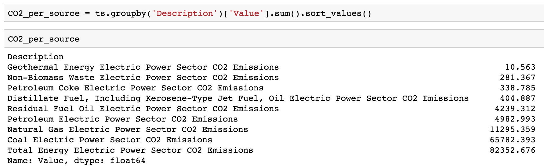
画柱状图
1
2
3
4
5
6
7
8
9
10
fig = plt.figure(figsize = (16 ,9 )) x_label = map (lambda x: x[:20 ],CO2_per_source.index) x_tick = np.arange(len (cols)) plt.bar(x_tick, CO2_per_source, align = 'center' , alpha = 0.5 ) fig.suptitle("CO2 Emissions by Electric Power Sector" , fontsize= 25 ) plt.xticks(x_tick, x_label, rotation = 70 , fontsize = 15 ) plt.yticks(fontsize = 20 ) plt.xlabel('Carbon Emissions in MMT' , fontsize = 20 ) plt.show()
重叠图
1
2
3
4
5
6
7
8
9
10
11
12
13
14
15
16
17
18
19
20
from statsmodels.tsa.seasonal import seasonal_decomposedecomposition = seasonal_decompose(mte) trend = decomposition.trend seasonal = decomposition.seasonal residual = decomposition.resid plt.subplot(411 ) plt.plot(mte, label='Original' ) plt.legend(loc='best' ) plt.subplot(412 ) plt.plot(trend, label='Trend' ) plt.legend(loc='best' ) plt.subplot(413 ) plt.plot(seasonal,label='Seasonality' ) plt.legend(loc='best' ) plt.subplot(414 ) plt.plot(residual, label='Residuals' ) plt.legend(loc='best' ) plt.tight_layout()
环形图
1 2 3 4 5 6 7 8 9 10 11 12 plt.subplots(figsize=(15 ,15 )) data=response['PublicDatasetsSelect' ].str .split(',' ) dataset=[] for i in data.dropna(): dataset.extend(i) pd.Series(dataset).value_counts().plot.pie(autopct='%1.1f%%' ,colors=sns.color_palette('Paired' ,10 ),startangle=90 ,wedgeprops = { 'linewidth' : 2 , 'edgecolor' : 'white' }) plt.title('Dataset Source' ) my_circle=plt.Circle( (0 ,0 ), 0.7 , color='white' ) p=plt.gcf() p.gca().add_artist(my_circle) plt.ylabel('' ) plt.show()
饼状图
1 2 3 4 5 6 7 8 f,ax=plt.subplots(1 ,2 ,figsize=(18 ,8 )) response['JobSkillImportancePython' ].value_counts().plot.pie(ax=ax[0 ],autopct='%1.1f%%' ,explode=[0.1 ,0 ,0 ],shadow=True ,colors=['g' ,'lightblue' ,'r' ]) ax[0 ].set_title('Python Necessity' ) ax[0 ].set_ylabel('' ) response['JobSkillImportanceR' ].value_counts().plot.pie(ax=ax[1 ],autopct='%1.1f%%' ,explode=[0 ,0.1 ,0 ],shadow=True ,colors=['lightblue' ,'g' ,'r' ]) ax[1 ].set_title('R Necessity' ) ax[1 ].set_ylabel('' ) plt.show()
维恩图
1 2 3 4 5 6 7 f,ax=plt.subplots(1 ,2 ,figsize=(18 ,8 )) pd.Series([python.shape[0 ],R.shape[0 ],both.shape[0 ]],index=['Python' ,'R' ,'Both' ]).plot.bar(ax=ax[0 ]) ax[0 ].set_title('Number of Users' ) venn2(subsets = (python.shape[0 ],R.shape[0 ],both.shape[0 ]), set_labels = ('Python Users' , 'R Users' )) plt.title('Venn Diagram for Users' ) plt.show()
Seaborn count plot
1 2 3 plt.subplots(figsize=(22 ,12 )) sns.countplot(y=response['GenderSelect' ],order=response['GenderSelect' ].value_counts().index) plt.show()
利用squarify画树形图
1
2
3
4
5
6
7
import squarifytree=response['Country' ].value_counts().to_frame() squarify.plot(sizes=tree['Country' ].values,label=tree.index,color=sns.color_palette('RdYlGn_r' ,52 )) plt.rcParams.update({'font.size' :20 }) fig=plt.gcf() fig.set_size_inches(40 ,15 ) plt.show()
sns画分布图
1 2 3 4 5 plt.subplots(figsize=(15 ,8 )) salary=salary[salary['Salary' ]<1000000 ] sns.distplot(salary['Salary' ]) plt.title('Salary Distribution' ,size=15 ) plt.show()
sns子图
1 2 3 4 5 6 7 8 9 10 11 12 13 14 15 f,ax=plt.subplots(1 ,2 ,figsize=(18 ,8 )) sal_coun=salary.groupby('Country' )['Salary' ].median().sort_values(ascending=False )[:15 ].to_frame() sns.barplot('Salary' ,sal_coun.index,data=sal_coun,palette='RdYlGn' ,ax=ax[0 ]) ax[0 ].axvline(salary['Salary' ].median(),linestyle='dashed' ) ax[0 ].set_title('Highest Salary Paying Countries' ) ax[0 ].set_xlabel('' ) max_coun=salary.groupby('Country' )['Salary' ].median().to_frame() max_coun=max_coun[max_coun.index.isin(resp_coun.index)] max_coun.sort_values(by='Salary' ,ascending=True ).plot.barh(width=0.8 ,ax=ax[1 ],color=sns.color_palette('RdYlGn' )) ax[1 ].axvline(salary['Salary' ].median(),linestyle='dashed' ) ax[1 ].set_title('Compensation of Top 15 Respondent Countries' ) ax[1 ].set_xlabel('' ) ax[1 ].set_ylabel('' ) plt.subplots_adjust(wspace=0.8 ) plt.show()
seaborn箱型图
1 2 3 4 plt.subplots(figsize=(10 ,8 )) sns.boxplot(y='GenderSelect' ,x='Salary' ,data=salary) plt.ylabel('' ) plt.show()
seaborn count_plot
1 2 3 4 5 6 7 8 9 f,ax=plt.subplots(1 ,2 ,figsize=(25 ,15 )) sns.countplot(y=response['MajorSelect' ],ax=ax[0 ],order=response['MajorSelect' ].value_counts().index) ax[0 ].set_title('Major' ) ax[0 ].set_ylabel('' ) sns.countplot(y=response['CurrentJobTitleSelect' ],ax=ax[1 ],order=response['CurrentJobTitleSelect' ].value_counts().index) ax[1 ].set_title('Current Job' ) ax[1 ].set_ylabel('' ) plt.subplots_adjust(wspace=0.8 ) plt.show()
seaborn 图中添加文字
1 2 3 4 5 6 7 8 sal_job=salary.groupby('CurrentJobTitleSelect' )['Salary' ].median().to_frame().sort_values(by='Salary' ,ascending=False ) ax=sns.barplot(sal_job.Salary,sal_job.index,palette=sns.color_palette('inferno' ,20 )) plt.title('Compensation By Job Title' ,size=15 ) for i, v in enumerate (sal_job.Salary): ax.text(.5 , i, v,fontsize=10 ,color='white' ,weight='bold' ) fig=plt.gcf() fig.set_size_inches(8 ,8 ) plt.show()
词云
1
2
3
4
5
6
7
8
9
10
11
12
13
14
15
16
17
18
19
20
21
22
23
24
25
from wordcloud import WordCloud, STOPWORDSimport nltkfrom nltk.corpus import stopwordsfree=pd.read_csv('../input/freeformResponses.csv' ) stop_words=set (stopwords.words('english' )) stop_words.update(',' ,';' ,'!' ,'?' ,'.' ,'(' ,')' ,'$' ,'#' ,'+' ,':' ,'...' ) motivation=free['KaggleMotivationFreeForm' ].dropna().apply(nltk.word_tokenize) motivate=[] for i in motivation: motivate.extend(i) motivate=pd.Series(motivate) motivate=([i for i in motivate.str .lower() if i not in stop_words]) f1=open ("kaggle.png" , "wb" ) f1.write(codecs.decode(kaggle,'base64' )) f1.close() img1 = imread("kaggle.png" ) hcmask1 = img1 wc = WordCloud(background_color="black" , max_words=4000 , mask=hcmask1, stopwords=STOPWORDS, max_font_size= 60 ,width=1000 ,height=1000 ) wc.generate(" " .join(motivate)) plt.imshow(wc) plt.axis('off' ) fig=plt.gcf() fig.set_size_inches(10 ,10 ) plt.show()
简单情况下的分类展示
1
2
3
4
5
6
7
8
9
10
11
12
13
14
15
16
17
18
19
20
21
22
23
24
from IPython import displayh = 0.01 x_min, x_max = X[:, 0 ].min () - 1 , X[:, 0 ].max () + 1 y_min, y_max = X[:, 1 ].min () - 1 , X[:, 1 ].max () + 1 xx, yy = np.meshgrid(np.arange(x_min, x_max, h), np.arange(y_min, y_max, h)) def visualize (X, y, w, history ): """draws classifier prediction with matplotlib magic""" Z = probability(expand(np.c_[xx.ravel(), yy.ravel()]), w) Z = Z.reshape(xx.shape) plt.subplot(1 , 2 , 1 ) plt.contourf(xx, yy, Z, alpha=0.8 ) plt.scatter(X[:, 0 ], X[:, 1 ], c=y, cmap=plt.cm.Paired) plt.xlim(xx.min (), xx.max ()) plt.ylim(yy.min (), yy.max ()) plt.subplot(1 , 2 , 2 ) plt.plot(history) plt.grid() ymin, ymax = plt.ylim() plt.ylim(0 , ymax) display.clear_output(wait=True ) plt.show()
图中插入LaTeX公式
1
2
3
4
5
6
7
8
9
10
import matplotlib.pyplot as plt%matplotlib inline x = np.linspace(-3 , 3 ) x_squared, x_squared_der = s.run([scalar_squared, derivative[0 ]], {my_scalar:x}) plt.plot(x, x_squared,label="$x^2$" ) plt.plot(x, x_squared_der, label=r"$\frac{dx^2}{dx}$" ) plt.legend();
画多张子图
1 2 3 4 5 6 7 8 9 10 11 12 13 cols = 8 rows = 2 fig = plt.figure(figsize=(2 * cols - 1 , 2.5 * rows - 1 )) for i in range (cols): for j in range (rows): random_index = np.random.randint(0 , len (y_train)) ax = fig.add_subplot(rows, cols, i * rows + j + 1 ) ax.grid('off' ) ax.axis('off' ) ax.imshow(x_train[random_index, :]) ax.set_title(cifar10_classes[y_train[random_index, 0 ]]) plt.show()
特征工程阶段 Numpy区间百分比切分异常值
1 2 3 lat_low, lat_hgh = np.percentile(latlong[:,0 ], [2 , 98 ]) lon_low, lon_hgh = np.percentile(latlong[:,1 ], [2 , 98 ])
初始化同shape向量
1
2
3
4
5
6
7
8
9
10
11
g2 = np.zeros_like(w) `` ------- 累积sum ``` python a = np.array([[1 ,2 ,3 ], [4 ,5 ,6 ]]) >>> np.cumsum(a,axis=1 ) array([[ 1 , 3 , 6 ], [ 4 , 9 , 15 ]])
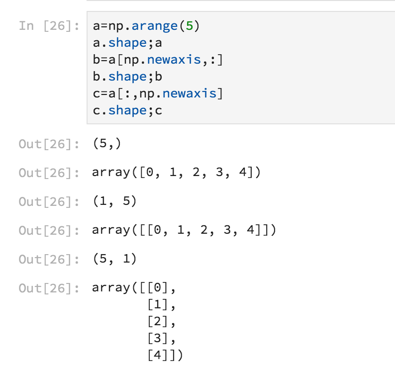
numpy array 扩展维度,很简单地将Numpy向量扩展为二维矩阵
Numpy 竖着叠放向量np.column_stack
1 2 3 np.abs (combined[:ntrain].skew()).sort_values(ascending = False ).head(20 )
有偏度 - 需要处理。通常是用log1p
1 2 ts['Value' ] = pd.to_numeric(ts['Value' ] , errors='coerce' )
过滤index 里面的NaN值,推广也可以过滤其他列
1 ts = df.loc[pd.Series(pd.to_datetime(df.index, errors='coerce' )).notnull().values]
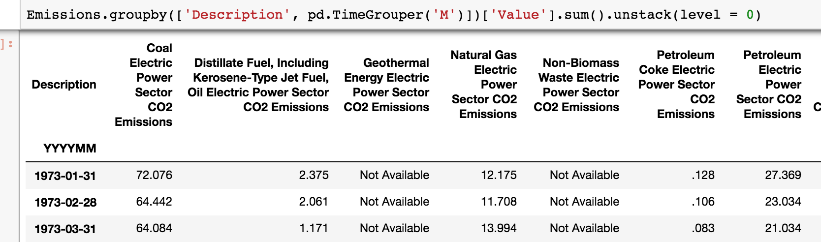
按月groupby,以及unstack解构
1 Emissions.groupby(['Description' , pd.TimeGrouper('M' )])['Value' ].sum ().unstack(level = 0 )
将value_counts、groupby等Series转换为Dataframe
1 tree=response['Country' ].value_counts().to_frame()
特征工程大杀器,Pandas Pipe
1 2 3 4 5 6 7 8 9 10 11 12 13 14 15 16 17 18 19 20 pipe_basic = [pipe_basic_fillna,pipe_bypass,\ pipe_bypass,pipe_bypass,\ pipe_bypass,pipe_bypass,\ pipe_log_getdummies,pipe_bypass, \ pipe_export,pipe_r2test] pipe_ascat = [pipe_fillna_ascat,pipe_drop_cols,\ pipe_drop4cols,pipe_outliersdrop,\ pipe_extract,pipe_bypass,\ pipe_log_getdummies,pipe_drop_dummycols, \ pipe_export,pipe_r2test] pipe_ascat_unitprice = [pipe_fillna_ascat,pipe_drop_cols,\ pipe_drop4cols,pipe_outliersdrop,\ pipe_extract,pipe_unitprice,\ pipe_log_getdummies,pipe_drop_dummycols, \ pipe_export,pipe_r2test] pipes = [pipe_basic,pipe_ascat,pipe_ascat_unitprice ]
跑的代码为
1 2 3 4 5 6 7 8 9 10 11 12 13 14 15 16 17 for i in range (len (pipes)): print ("*" *10 ,"\n" ) pipe_output=pipes[i] output_name ="_" .join([x.__name__[5 :] for x in pipe_output if x.__name__ is not "pipe_bypass" ]) output_name = "PIPE_" +output_name print (output_name) (combined.pipe(pipe_output[0 ]) .pipe(pipe_output[1 ]) .pipe(pipe_output[2 ]) .pipe(pipe_output[3 ]) .pipe(pipe_output[4 ]) .pipe(pipe_output[5 ]) .pipe(pipe_output[6 ]) .pipe(pipe_output[7 ]) .pipe(pipe_output[8 ],name=output_name) .pipe(pipe_output[9 ]) )
在这一步,我们可以初步看到三个特征工程的性能。并且文件已经输出到hd5格式文件。后期在训练和预测时,直接取出预处理的文件就可以。各个pipe代码可见此处 。
调参阶段 在数据准备好后训练时,最基本的就是要调整超参(Hyperparameter)耗时耗力,并且和发生错误和遗漏情况。
算法预测的结果差异非常大。 其中一个可能就是训练时的标准化步骤,在预测时遗漏了。
算法的调参结果差异非常大。(有的是0.01,有的就是10)。其中的一个可能就是不同的训练步骤中采用的标准化算法不同(例如,一次用了StandardScaler, 另一次用了RobustScaler)
此外,繁多的超参数调整起来异常繁琐。比较容易错误或者写错。
解决方法:Pipeline + Gridsearch + 参数字典 + 容器。
针对线形回归问题,Sklearn提供了超过15种回归算法。利用Pipeline 大法可以综合测试所有算法,找到最合适的算法。 具体步骤如下:
初始化所有希望调测线形回归。
建立一个字典容器。{“算法名称”:[初始算法对象,参数字典,训练好的Pipeline模型对象,CV的成绩}
在调参步骤,将初始算法用Pipeline包装起来,利用Gridsearch进行调参。调参完成后可以得到针对相应的CV而获得的最后模型对象。 例如: lasso 算法的步骤如下:
包装 pipe=Pipeline([("scaler":None),("selector":None),("clf":Lasso()) * Pipe就是刚刚包装好的算法。可以直接用于 训练(fit)和预测(predict) * 使用Pipe来处理训练集和测试集可以避免错误和遗漏,提高效率。 * 但是Pipe中算法是默认的参数,直接训练出的模型RMSE不太理想。(例如:local CV, 0.12~0.14左右)。这时可以考虑调参。
调参第一步:准备参数字典:
调参第二步:暴力调参和生成模型 rsearch = GridSearchCV(pipe, param_grid=Params_lasso,scoring =’neg_mean_squared_error’,verbose=verbose,cv=10,refit =True)
GridSearch 是暴力调参。遍历所有参数组合,另外有一个RandomedSearch 可以随机选择参数组合,缩短调参时间,并且获得近似的调参性能
Pipe就是刚刚包装好的算法。GridSearch把可选的参数和算法(放入,或者更好的组合。
调参的训练标准是“’neg_mean_squared_error”, RMSE的负数。 这种处理方法,让最大值称为最小的MSE指。只需要对结果做一次np.sqrt( 结果负数)就能获得RMSE值。
cv=10. Cross Validate 数据集为9:1。数据集小的情况,例如House Price. 3折和10折结果甚至比调参差异还大。
refit =True. 在调参完成后,再需要做一次所有数据集的fit. 生成完整的训练模型
Sklearn 流程图